Balance and actions at the start
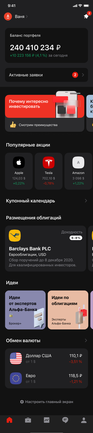
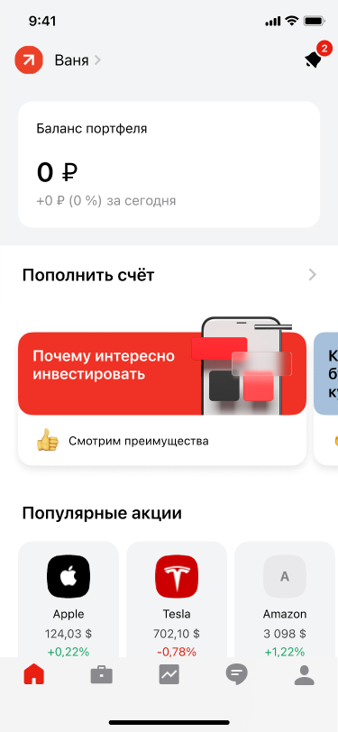
Portfolio and active orders let customers understand their account and act quickly. With no holdings, the interface places a funding step next to the balance.
We shaped the entry point to the investment app: portfolio and active orders for experienced customers, ideas and clear first steps for those just starting out.
Help newcomers navigate investing without slowing down customers who need their portfolio and frequent actions close at hand.

One of the Main section explorations from Figma
01 / Context
A newcomer needs explanations and a clear first step. A customer with a portfolio needs their balance, positions and quick access to familiar actions. The Main section had to serve both groups and support future product development.
02 / Hypotheses
The team showed redesigned sections to Affluent, A‑Club and active investment customers. Interviews began with their current experience and moved to a prototype. The original case records responses from six participants: four highlighted portfolio balance, three active orders, and four wanted immediate access to their assets and positions.
This is qualitative feedback from a small group, not a population estimate or a post-launch impact measure.
What belongs upfront, and what should people be able to rearrange?
03 / Design decisions
The team explored more than 35 concepts and selected the first set of widgets. The product and marketing teams reviewed the Main section and widget design twice a week. Four of the seven planned widgets needed new or adapted design-library components.
Portfolio and active orders let customers understand their account and act quickly. With no holdings, the interface places a funding step next to the balance.
Collections, ideas, popular securities and learning content support exploration without displacing personal portfolio information.
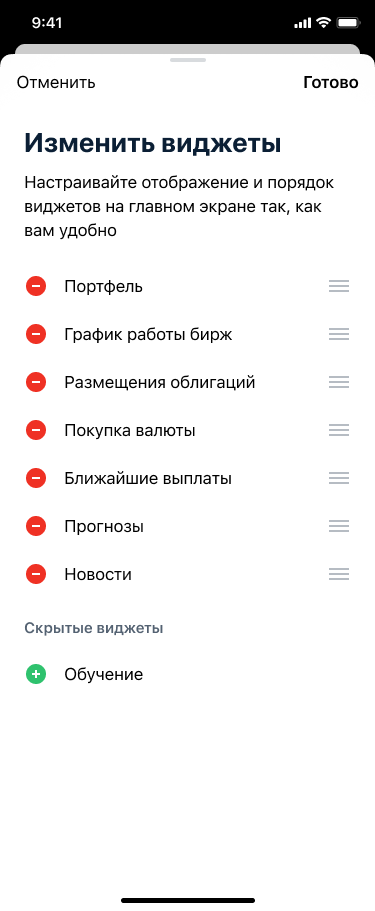
Some customers preferred to begin with their portfolio. The design allowed widgets to be reordered and hidden. This reflected that product version; the team later revisited the choice.
Design exploration
The Figma file preserves several Main section explorations. These two variants show how the composition evolved; they are not an A/B performance comparison.
04 / States and control
05 / Outcome
According to the project materials, the team prepared the first Main section in roughly four months, then added capabilities and widgets. My contribution was the Main section design; specialist teams worked on the other parts of the app redesign.
An earlier public case reports 122% active-user growth and 136% revenue growth in 2021. These are app-wide figures influenced by other product changes and marketing. They do not isolate the effect of this screen's design.