discovery interviews
March 2023 · three segments, including children. This case draws on the adult findings.
Turning achievements into a journey where customers can find a challenge, understand its rules, track progress and know when enhanced cashback becomes available
Make challenges part of the familiar loyalty journey: explain the benefit and rules before participation, then show when the earned reward can actually be used.
The core prototype sections, purchase notification, reward transition and reward animation
Open the interactive prototype ↗01 / Context
The team wanted to develop loyalty through challenges and rewards. Research showed that a game layer alone was not enough: customers needed to know the benefit, the required action and when the reward would become active.
My responsibility in Alfa Mobile was the journey and interface: entering from cashback, choosing a challenge, understanding its rules and progress, earning an achievement and using the reward.
Research and visual language were developed with specialist teams. I translated test findings into journey changes: putting value next to the badge, clarifying challenge rules, and separating completion from reward activation.
02 / Evidence
For adult participants, the main motivator was a concrete benefit. A badge made the reward more noticeable, but without clear requirements it was not enough to change habitual behaviour.
March 2023 · three segments, including children. This case draws on the adult findings.
October 2023 · 10 usability participants and a sample of 200 in an unmoderated study of two versions.
November 2023 · active customers with category cashback. Testing the updated journey.
03 / Product decisions
These comparisons show design versions before and after UX testing. “After” means the revised MVP design, not a separate measure of impact in the live product.
The name and badge caught attention, but participants could not see the benefit or the challenge rules.
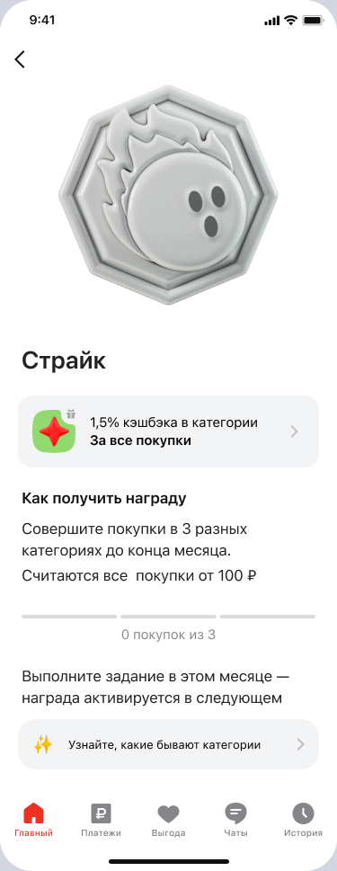
We put the cashback rate, requirement and progress next to the achievement, keeping the badge as an emotional accent.
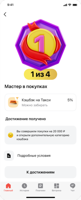
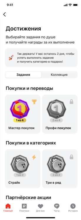
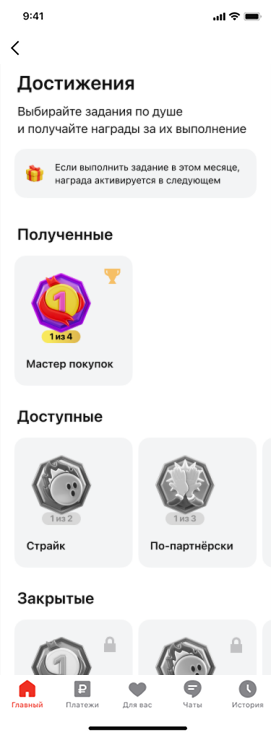
6 of 10 participants preferred the vertical catalogue, but neither version was clear enough.
We separated challenges and rewards into tabs and showed requirements, status and progress on each card.
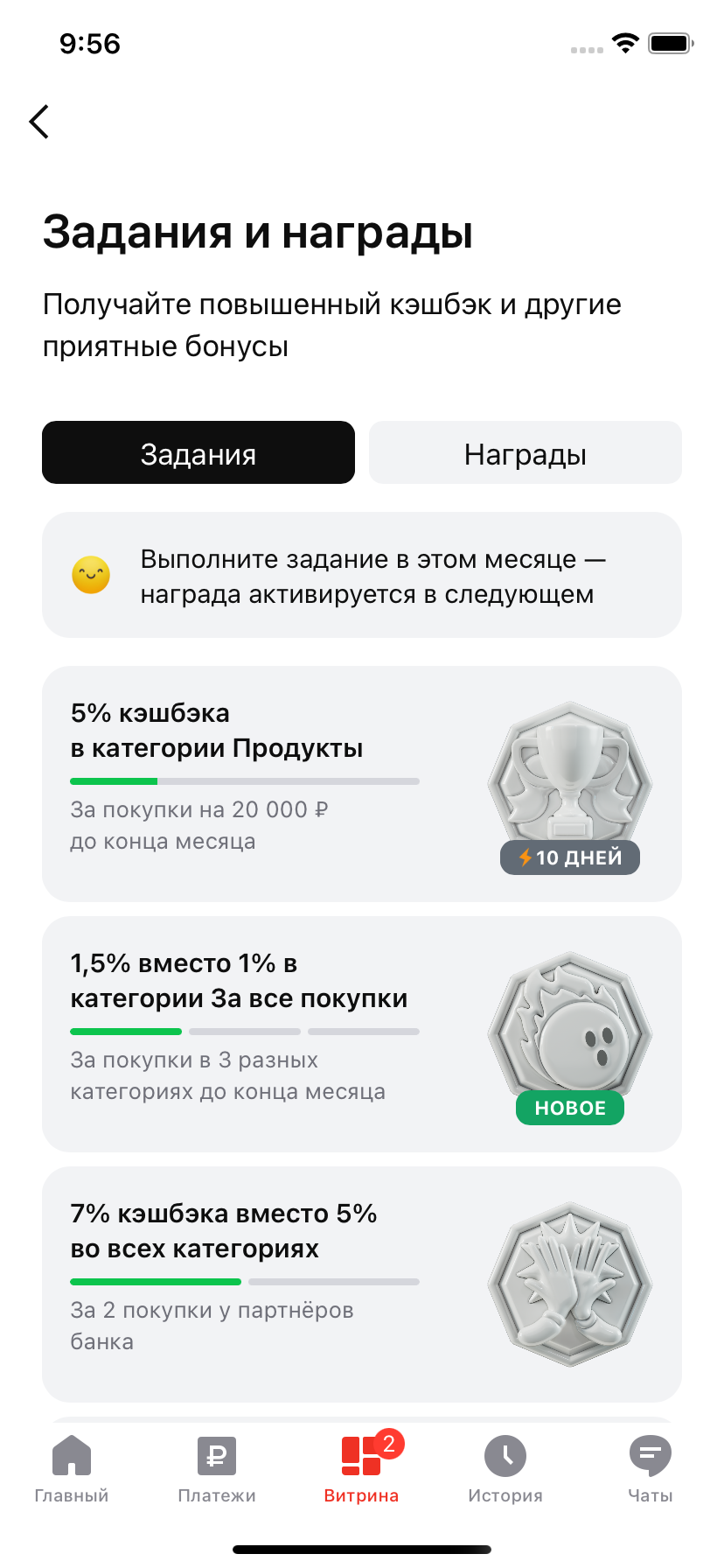
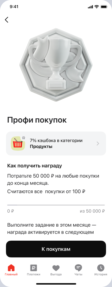
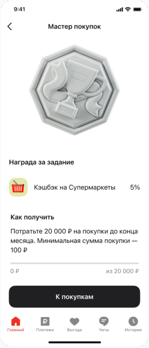
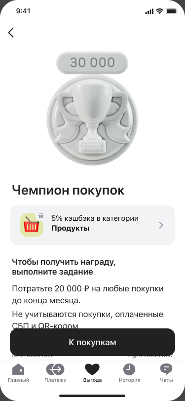
3 of 5 participants thought only supermarket purchases qualified for the reward. Few reached the FAQ.
We put “any purchases”, the amount and deadline on the challenge screen, with exclusions next to the action.
04 / The critical detail
The second test exposed a gap between completing a challenge and the reward becoming active: 2 of 5 participants did not understand that 25 November was the time to select December categories. People opened the challenge from its widget, bypassing the catalogue explanation. The activation date therefore needed to appear at every entry point.
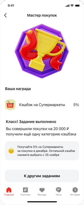
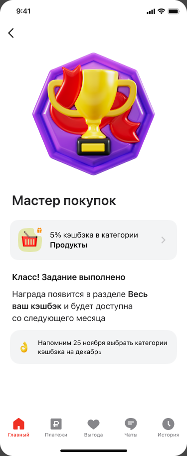
The revised journey
The revised completion screen captures just one moment. The full journey separates three events that had been easy to confuse.
In November, customers see the requirements, deadline and progress.
On 25 November, a reminder prompts selection of December categories.
In December, enhanced cashback is added to the selected categories.
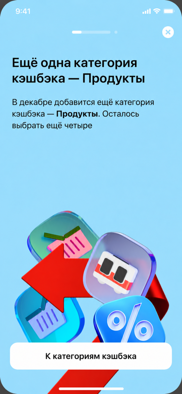
05 / State design
Beyond the core journey, the MVP covered spending, purchases across categories, partner purchases and referrals. Each needed progress, completion and delayed reward activation. Below are three examples of empty and intermediate states, not a catalogue of every challenge type.
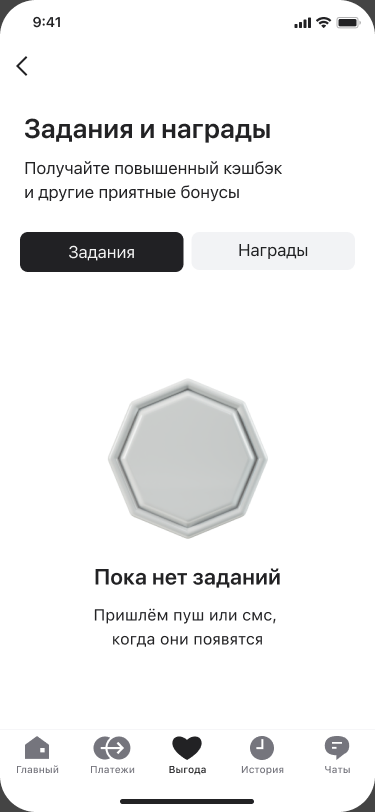
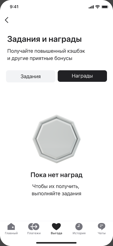
06 / Design outcome
Challenge cards and details show the benefit, requirements, deadline and progress. The achievement supports the journey rather than replacing the explanation.
After testing, the designs distinguish challenge completion, the reminder to select categories and the start of enhanced cashback.
The flow runs from entering the section to using the reward, including progress, completion, empty and edge states.
In banking gamification, emotion supports the journey rather than replacing it. People need to understand the benefit, the rules and when the reward becomes active — from the first action to using their cashback.